Brand Design Discovery

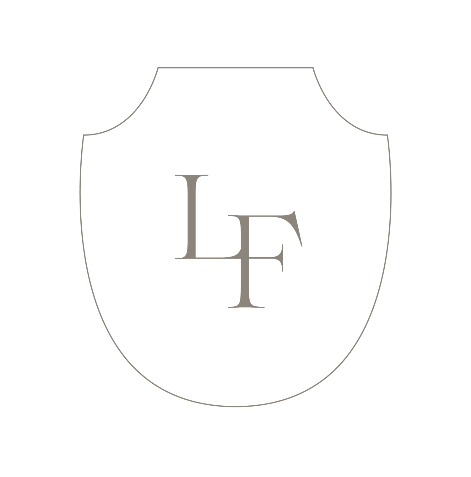
In 2020 we decided to enhance Lauren Field Design will a whole new logo and brand refresh. Our original logo has been with us since the beginning of this adventure and has served us well. We appreciated the simplicity and personal touch of the original “LF” Lauren had actually drawn herself,
Our collaboration with Sarah Ann Design really helped us understand what we wanted to see in our brand. We were both inspired by the warm colors in the depths of nature. The color palette of Limestone, clay, taupe, and ivory helped us explore the use of multiple layers. We wanted our type face to incorporate both script and serif features. We wanted to highlight the important elements of events and experiences that Lauren Field Designs excels in.
Within our design process we always create a mood board of imagery that is rich in composition but not too overwhelmed with color. We strive to understand the basis of our vision without duplicating someone else’s work. Sarah Ann took the most beautiful elements from our board and created a logo that showcases rich history with modern class.